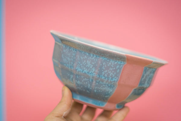
Our new Cotton Candy line of pigmented porcelain is launching this Saturday, December 8, 2018! See it in the shop.
A lot of testing and love has gone into developing our new Cotton Candy pigmented porcelain line. The real star player here has been our very own Allison Cochran. We sat down with her to pick her brain on everything that went into this work, from concept, to testing, down to the way it feels against your fingers.
Porcelain is a combination of glass, white clay, and something to make those two materials melt together, called “flux”. We work with porcelain because it is an incredibly refined combination of raw materials. Darker clays such as terracotta, red earthenware, or stoneware have impurities including iron and titanium that makes the clay red, dark, and opaque. A sound porcelain recipe, on the other hand, warrants a high value for its purity and strength. To bring it a step further, we have begun adding pigment to our porcelain recipe to introduce new possibilities to our color palette here at The Bright Angle.

TBA: So when when did this all start?
Allison: We started about a month and a half ago this fall by testing a whole range of colors in our porcelain based on the glaze colors we already use here - then tested some more just for fun! After that, we tested those porcelain colors with our glazes. Me and Nick picked a few favorites and among those, this was his favorite.

Did you encounter any obstacles when you were testing?
To get to this final combination is a lot of testing. Adding stain to the slip definitely changes the nature of the porcelain and color. There is a huge difference between having 10% of the recipe consist of stain versus only 5%. Also, I already had quite a bit of background in doing this, but in the past I’ve faced a lot of trial an error in figuring out how to do this.
Oh I see, so you already knew what was up, because you have experience in this.
I’ve basically dedicated a year and a half to testing this technique before coming to TBA, so it was nice to have the chance to use that experience and not have so many hurdles to overcome.
Can you talk about the stains used to color the porcelain?
This kind of came out of a feeling that, in ceramic art, we usually get our colors from glazes and firing techniques. That’s how all of the Flagship Collection started - colorful glaze over white porcelain. But I love the quality of raw porcelain, so staining clay with the pigments was a way to not have to glaze, but still have that bright palette. Because the thing is it’s really opaque which gives it a different, almost plastic feel.

More technically, Mason Stain is one of the biggest stain companies. They have a bigger selection compared to other companies, but it’s still pretty limited, so I got into mixing them myself to widen my palate. So that’s the nice thing - you can get a big range that’s fairly stable. Most of the colors show up in the type of firing we do. We just add it directly to the clay body just like another ingredient to change the color of the clay itself. Since our base to start, like paint, is white, these stains work really well. They might not come through the same with, say, a dark stoneware.

So tell me about that pink stripe.
It started because I was adding colored handles and then exposing the strip that the handle was sitting on, but then I decided to flip it to the other side. The contrast of the stripe and the handle seperate the form a bit.
The coloring Flagship Collection [at The Bright Angle] has been heavily based around glaze, whereas I in my own work keep the clay raw on the outside and only glaze the inside. So the stripe is there to show what’s happening underneath. Same goes for pieces with visible bases, like the Native Tray.

The stripe creates a change in feeling that I really like. Within one piece there’s three totally different surfaces: glazed, raw sides, and sanded raw bottoms. Sanded porcelain on its own is a beautiful surface, but then the color that adds another component.
It also tells people what is happening with the porcelain. Although [us potters] would like to think they do, not everyone flips a pot over to see the bottom, so the stripe draws attention to what is happening.

Then there’s the progression of the form - the facets really lend itself to do that. I like the simplicity of it.

It really adds a lot of interest.
Yeah I like the way it moves, and even though I wipe off the glaze in that stripe, it still leaves a softness to that surface. It adds to it without being overwhelming, because this combo itself is already pretty loud, so adding even more would’ve been a lot. I think it’s a good balance.
Do you think there will be more colors in the future?
I hope we do. The stuff we tested fits into the palette we already have at The Bright Angle. We have that colors we initially tested, but the great thing about stain is the possibilities, so hopefully the palate can evolve.


Share and get 15% off!
Simply share this product on one of the following social networks and you will unlock 15% off!